Plot scatter plot with bar & error bars for 2-way ANOVAs with or without a blocking factor.
Source:R/plot_4d_scatterbar.R
plot_4d_scatterbar.RdThere are 4 related functions for 2-way ANOVA type plots. In addition to a categorical variable along the X-axis, a grouping factor is passed to either points, bars or boxes argument in these functions. A blocking factor (or any other categorical variable) can be optionally passed to the shapes argument.
plot_4d_point_sd(mean & SD, SEM or CI95 error bars)plot_4d_scatterbar(bar & SD, SEM or CI95 error bars)plot_4d_scatterbox(box & whiskers)plot_4d_scatterviolin(box & whiskers, violin)
plot_4d_scatterbar(
  data,
  xcol,
  ycol,
  bars,
  shapes,
  facet,
  ErrorType = "SD",
  symsize = 3,
  s_alpha = 0.8,
  b_alpha = 1,
  bwid = 0.7,
  jitter = 0.1,
  ewid = 0.2,
  TextXAngle = 0,
  LogYTrans,
  LogYBreaks = waiver(),
  LogYLabels = waiver(),
  LogYLimits = NULL,
  facet_scales = "fixed",
  fontsize = 20,
  group_wid = 0.8,
  symthick,
  bthick,
  ColPal = c("okabe_ito", "all_grafify", "bright", "contrast", "dark", "fishy", "kelly",
    "light", "muted", "pale", "r4", "safe", "vibrant"),
  ColRev = FALSE,
  ColSeq = TRUE,
  ...
)
Arguments
- data
a data table, e.g. data.frame or tibble.
- xcol
name of the column (without quotes) with the categorical factor to plot on X axis. If column is numeric, enter as
factor(col).- ycol
name of the column (without quotes) with the quantitative variable to plot on the Y axis.
- bars
name of the column containing grouping within the factor plotted on X axis. Can be categorical or numeric X. If your table has numeric X and you want to plot as factor, enter
xcol = factor(name of colum).- shapes
name of the column (without quotes) that contains matched observations (e.g. subject IDs, experiment number) or another variable to pass on to symbol shapes. If not provided, the shapes for all groups is the same.
- facet
add another variable (without quotes) from the data table to create faceted graphs using
facet_wrap.- ErrorType
select the type of error bars to display. Default is "SD" (standard deviation). Other options are "SEM" (standard error of the mean) and "CI95" (95% confidence interval based on t distributions).
- symsize
size of symbols, default set to 3.
- s_alpha
fractional opacity of symbols, default set to 0.8 (i.e. 80% opacity). Set
s_alpha = 0to not show scatter plot.- b_alpha
fractional opacity of boxes. Default is set to 0, which results in white boxes inside violins. Change to any value >0 up to 1 for different levels of transparency.
- bwid
width of boxes; default 0.7.
- jitter
extent of jitter (scatter) of symbols, default is 0.1. Increase to reduce symbol overlap, set to 0 for aligned symbols.
- ewid
width of error bars, default set to 0.2.
- TextXAngle
orientation of text on X-axis; default 0 degrees. Change to 45 or 90 to remove overlapping text.
- LogYTrans
transform Y axis into "log10" or "log2" (in quotes).
- LogYBreaks
argument for
scale_y_continuousfor Y axis breaks on log scales, default iswaiver(), or provide a vector of desired breaks.- LogYLabels
argument for
scale_y_continuousfor Y axis labels on log scales, default iswaiver(), or provide a vector of desired labels.- LogYLimits
a vector of length two specifying the range (minimum and maximum) of the Y axis.
- facet_scales
whether or not to fix scales on X & Y axes for all facet facet graphs. Can be
fixed(default),free,free_yorfree_x(for Y and X axis one at a time, respectively).- fontsize
parameter of
base_sizeof fonts intheme_classic, default set to size 20.- group_wid
space between the factors along X-axis, i.e., dodge width. Default
group_wid = 0.8(range 0-1), which can be set to 0 if you'd like the two plotted asposition = position_identity().- symthick
size (in 'pt' units) of outline of symbol lines (
stroke), default =fontsize/22.- bthick
thickness (in 'pt' units) of bar and error bar lines; default =
fontsize/22.- ColPal
grafify colour palette to apply (in quotes), default "okabe_ito"; see
graf_palettesfor available palettes.- ColRev
whether to reverse order of colour within the selected palette, default F (FALSE); can be set to T (TRUE).
- ColSeq
logical TRUE or FALSE. Default TRUE for sequential colours from chosen palette. Set to FALSE for distant colours, which will be applied using
scale_fill_grafify2.- ...
any additional arguments to pass to
stat_summaryorgeom_point.
Value
This function returns a ggplot2 object of class "gg" and "ggplot".
Details
These can be especially useful when the fourth variable shapes is a random factor or blocking factor (up to 25 levels are allowed; there will be an error with more levels). The shapes argument can be left blank to plot ordinary 2-way ANOVAs without blocking.
In plot_4d_point_sd and plot_4d_scatterbar, the default error bar is SD (can be changed to SEM or CI95). In plot_4d_point_sd, a large coloured symbol is plotted at the mean, all other data are shown as smaller symbols. Boxplot uses geom_boxplot to depict median (thicker line), box (interquartile range (IQR)) and the whiskers (1.5*IQR).
Colours can be changed using ColPal, ColRev or ColSeq arguments.
ColPal can be one of the following: "okabe_ito", "dark", "light", "bright", "pale", "vibrant, "muted" or "contrast".
ColRev (logical TRUE/FALSE) decides whether colours are chosen from first-to-last or last-to-first from within the chosen palette.
ColSeq (logical TRUE/FALSE) decides whether colours are picked by respecting the order in the palette or the most distant ones using colorRampPalette.
The resulting ggplot2 graph can take additional geometries or other layers.
Examples
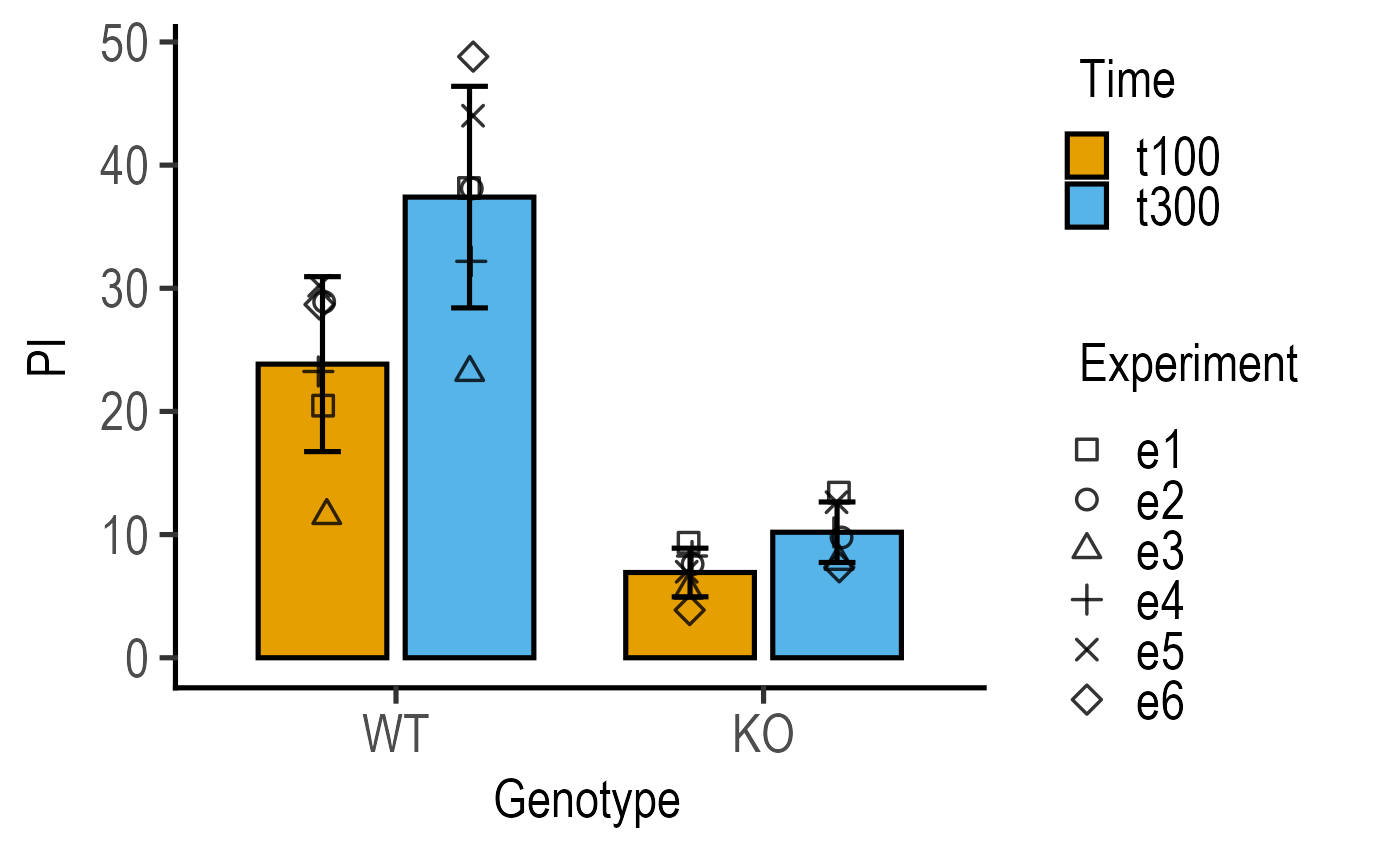
#4d version for 2-way data with blocking
plot_4d_scatterbar(data = data_2w_Tdeath,
xcol = Genotype,
ycol = PI,
bars = Time,
shapes = Experiment)
 #4d version without blocking factor
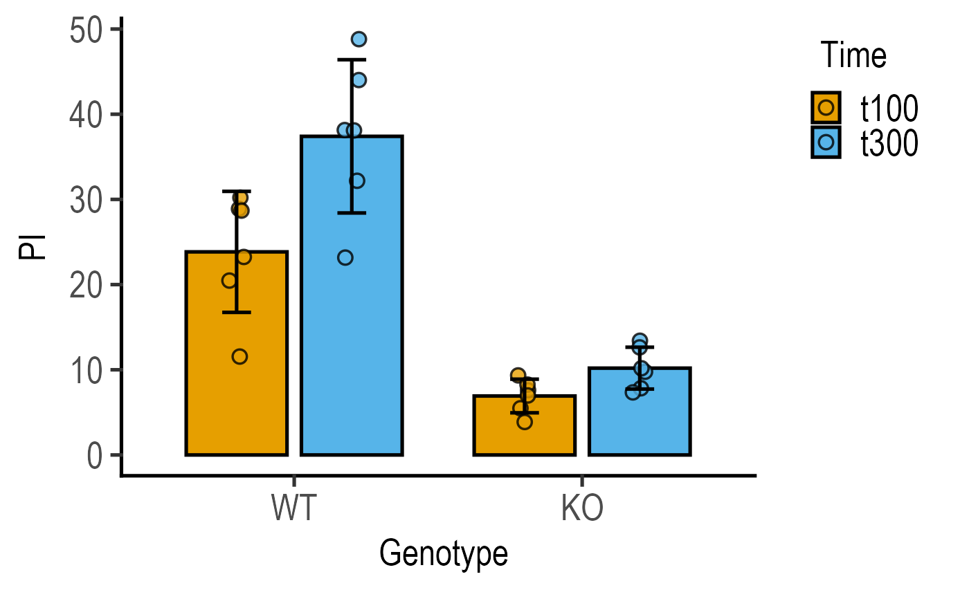
#`shapes` can be left blank
plot_4d_scatterbar(data = data_2w_Tdeath,
xcol = Genotype,
ycol = PI,
bars = Time)
#4d version without blocking factor
#`shapes` can be left blank
plot_4d_scatterbar(data = data_2w_Tdeath,
xcol = Genotype,
ycol = PI,
bars = Time)