Plot a bar graph indicating mean with error bars (SD) using two variables.
Source:R/plot_bar_sd.R
plot_bar_sd.RdThis function takes a data table, categorical X and numeric Y variables, and plots bars showing the mean with SD error bars. The X variable is mapped to the fill aesthetic of bars.
plot_bar_sd(
  data,
  xcol,
  ycol,
  facet,
  b_alpha = 1,
  bwid = 0.7,
  ewid = 0.3,
  TextXAngle = 0,
  LogYTrans,
  LogYBreaks = waiver(),
  LogYLabels = waiver(),
  LogYLimits = NULL,
  facet_scales = "fixed",
  fontsize = 20,
  bthick,
  ColPal = c("okabe_ito", "all_grafify", "bright", "contrast", "dark", "fishy", "kelly",
    "light", "muted", "pale", "r4", "safe", "vibrant"),
  ColSeq = TRUE,
  ColRev = FALSE,
  SingleColour = "NULL",
  ...
)
Arguments
- data
a data table object, e.g. a data.frame or tibble.
- xcol
name of the column to plot on X axis. This should be a categorical variable.
- ycol
name of the column to plot on the Y axis. This should be a quantitative variable.
- facet
add another variable from the data table to create faceted graphs using
ggplot2facet_wrap.- b_alpha
fractional opacity of bars, default set to .5 (i.e. 50% transparent).
- bwid
width of bars, default 0.7
- ewid
width of error bars, default 0.3
- TextXAngle
orientation of text on X-axis; default 0 degrees. Change to 45 or 90 to remove overlapping text.
- LogYTrans
transform Y axis into "log10" or "log2"
- LogYBreaks
argument for
ggplot2[scale_y_continuous]for Y axis breaks on log scales, default iswaiver(), or provide a vector of desired breaks.- LogYLabels
argument for
ggplot2[scale_y_continuous]for Y axis labels on log scales, default iswaiver(), or provide a vector of desired labels.- LogYLimits
a vector of length two specifying the range (minimum and maximum) of the Y axis.
- facet_scales
whether or not to fix scales on X & Y axes for all facet facet graphs. Can be
fixed(default),free,free_yorfree_x(for Y and X axis one at a time, respectively).- fontsize
parameter of
base_sizeof fonts intheme_classic, default set to size 20.- bthick
thickness (in 'pt' units) of bar and error bar lines; default =
fontsize/- ColPal
grafify colour palette to apply, default "okabe_ito"; see
graf_palettesfor available palettes.- ColSeq
logical TRUE or FALSE. Default TRUE for sequential colours from chosen palette. Set to FALSE for distant colours, which will be applied using
scale_fill_grafify2.- ColRev
whether to reverse order of colour within the selected palette, default F (FALSE); can be set to T (TRUE).
- SingleColour
a colour hexcode (starting with #), a number between 1-154, or names of colours from
grafifycolour palettes to fill along X-axis aesthetic. Accepts any colour other than "black"; usegrey_lin11, which is almost black.- ...
any additional arguments to pass to
stat_summary.
Value
This function returns a ggplot2 object of class "gg" and "ggplot".
Details
The function uses stat_summary with geom = "bar". Standard deviation (SD) is plotted through stat_summary calculated using mean_sdl from the ggplot2 package (get help with ?mean_sdl), and 1x SD is plotted (fun.arg = list(mult = 1).
Colours can be changed using ColPal, ColRev or ColSeq arguments. Colours available can be seen quickly with plot_grafify_palette.
ColPal can be one of the following: "okabe_ito", "dark", "light", "bright", "pale", "vibrant, "muted" or "contrast".
ColRev (logical TRUE/FALSE) decides whether colours are chosen from first-to-last or last-to-first from within the chosen palette.
ColSeq decides whether colours are picked by respecting the order in the palette or the most distant ones using colorRampPalette.
If there are many groups along the X axis and you prefer a single colour for the graph,use the SingleColour argument.
You are instead encouraged to show all data using the following functions: plot_scatterbar_sd, plot_scatterbox, plot_dotbox, plot_dotbar_sd, plot_scatterviolin or plot_dotviolin.
Examples
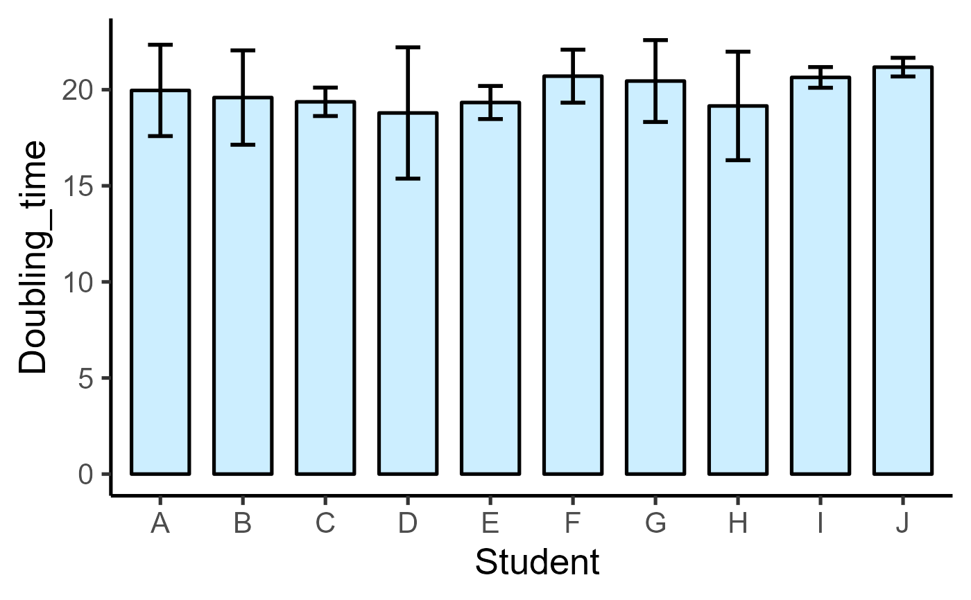
#Basic usage
plot_bar_sd(data = data_doubling_time,
xcol = Student, ycol = Doubling_time)
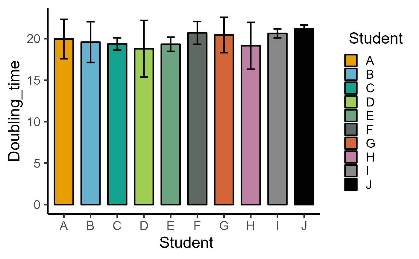
 #apply distant colours in the default palette
plot_bar_sd(data = data_doubling_time,
xcol = Student, ycol = Doubling_time,
ColSeq = FALSE)
#apply distant colours in the default palette
plot_bar_sd(data = data_doubling_time,
xcol = Student, ycol = Doubling_time,
ColSeq = FALSE)
 #single colour along X axis aesthetic
plot_bar_sd(data = data_doubling_time,
xcol = Student, ycol = Doubling_time,
SingleColour = "pale_cyan")
#single colour along X axis aesthetic
plot_bar_sd(data = data_doubling_time,
xcol = Student, ycol = Doubling_time,
SingleColour = "pale_cyan")