Plot a point as mean with SD error bars using two variables.
Source:R/plot_point_sd.R
plot_point_sd.RdThere are 4 related functions that use geom_point to plot a categorical variable along the X axis.
plot_point_sd (mean & SD, SEM or CI95 error bars)
plot_scatterbar_sd (bar & SD, SEM or CI95 error bars)
plot_scatterbox (box & whiskers)
plot_scatterviolin (box & whiskers, violin)
plot_point_sd(
  data,
  xcol,
  ycol,
  facet,
  ErrorType = "SD",
  symsize = 3.5,
  s_alpha = 1,
  symshape = 22,
  all_alpha = 0.3,
  all_size = 2.5,
  all_shape = 1,
  all_jitter = 0,
  ewid = 0.2,
  TextXAngle = 0,
  LogYTrans,
  LogYBreaks = waiver(),
  LogYLabels = waiver(),
  LogYLimits = NULL,
  facet_scales = "fixed",
  fontsize = 20,
  symthick,
  ethick,
  ColPal = c("okabe_ito", "all_grafify", "bright", "contrast", "dark", "fishy", "kelly",
    "light", "muted", "pale", "r4", "safe", "vibrant"),
  ColSeq = TRUE,
  ColRev = FALSE,
  SingleColour = "NULL",
  ...
)
Arguments
- data
a data table object, e.g. data.frame or tibble.
- xcol
name of the column (without quotes) with a X variable (will be forced to be a factor/categorical variable).
- ycol
name of the column (without quotes) with quantitative Y variable.
- facet
add another variable (without quotes) from the data table to create faceted graphs using
facet_wrap.- ErrorType
select the type of error bars to display. Default is "SD" (standard deviation). Other options are "SEM" (standard error of the mean) and "CI95" (95% confidence interval based on t distributions).
- symsize
size of point symbols, default set to 3.5.
- s_alpha
fractional opacity of symbols, default set to 1 (i.e. maximum opacity & zero transparency).
- symshape
The mean is shown with symbol of the shape number 22 (default, filled square). Pick a number between 21-25 to pick a different type of symbol from ggplot2.
- all_alpha
fractional opacity of all data points (default = 0.3). Set to non-zero value if you would like all data points plotted in addition to the mean.
- all_size
size of symbols of all data points, if shown (default = 2.5).
- all_shape
all data points are shown with symbols of the shape number 1 (default, transparent circle). Pick a number between 0-25 to pick a different type of symbol from ggplot2.
- all_jitter
reduce overlap of all data points, if shown, by setting a value between 0-1 (default = 0).
- ewid
width of error bars, default set to 0.2.
- TextXAngle
orientation of text on X-axis; default 0 degrees. Change to 45 or 90 to remove overlapping text.
- LogYTrans
transform Y axis into "log10" or "log2" (in quotes).
- LogYBreaks
argument for
scale_y_continuousfor Y axis breaks on log scales, default iswaiver(), or provide a vector of desired breaks.- LogYLabels
argument for
scale_y_continuousfor Y axis labels on log scales, default iswaiver(), or provide a vector of desired labels.- LogYLimits
a vector of length two specifying the range (minimum and maximum) of the Y axis.
- facet_scales
whether or not to fix scales on X & Y axes for all facet facet graphs. Can be
fixed(default),free,free_yorfree_x(for Y and X axis one at a time, respectively).- fontsize
parameter of
base_sizeof fonts intheme_classic, default set to size 20.- symthick
thickness of symbol border, default set to
fontsize/22.- ethick
thickness of error bar lines; default
fontsize/22.- ColPal
grafify colour palette to apply (in quotes), default "okabe_ito"; see
graf_palettesfor available palettes.- ColSeq
logical TRUE or FALSE. Default TRUE for sequential colours from chosen palette. Set to FALSE for distant colours, which will be applied using
scale_fill_grafify2.- ColRev
whether to reverse order of colour within the selected palette, default F (FALSE); can be set to T (TRUE).
- SingleColour
a colour hexcode (starting with #, e.g., "#E69F00"), a number between 1-154, or names of colours from
grafifyor base R palettes to fill along X-axis aesthetic. Accepts any colour other than "black"; usegrey_lin11, which is almost black.- ...
any additional arguments to pass to
stat_summary.
Value
This function returns a ggplot2 object of class "gg" and "ggplot".
Details
These functions take a data table, categorical X and numeric Y variables, and plot various geometries. The X variable is mapped to the fill aesthetic of symbols.
In plot_point_sd and plot_scatterbar_sd, default error bars are SD, which can be changed to SEM or CI95.
Colours can be changed using ColPal, ColRev or ColSeq arguments. Colours available can be seen quickly with plot_grafify_palette.
ColPal can be one of the following: "okabe_ito", "dark", "light", "bright", "pale", "vibrant, "muted" or "contrast".
ColRev (logical TRUE/FALSE) decides whether colours are chosen from first-to-last or last-to-first from within the chosen palette.
ColSeq (logical TRUE/FALSE) decides whether colours are picked by respecting the order in the palette or the most distant ones using colorRampPalette.
If there are many groups along the X axis and you prefer a single colour for the graph,use the SingleColour argument.
Examples
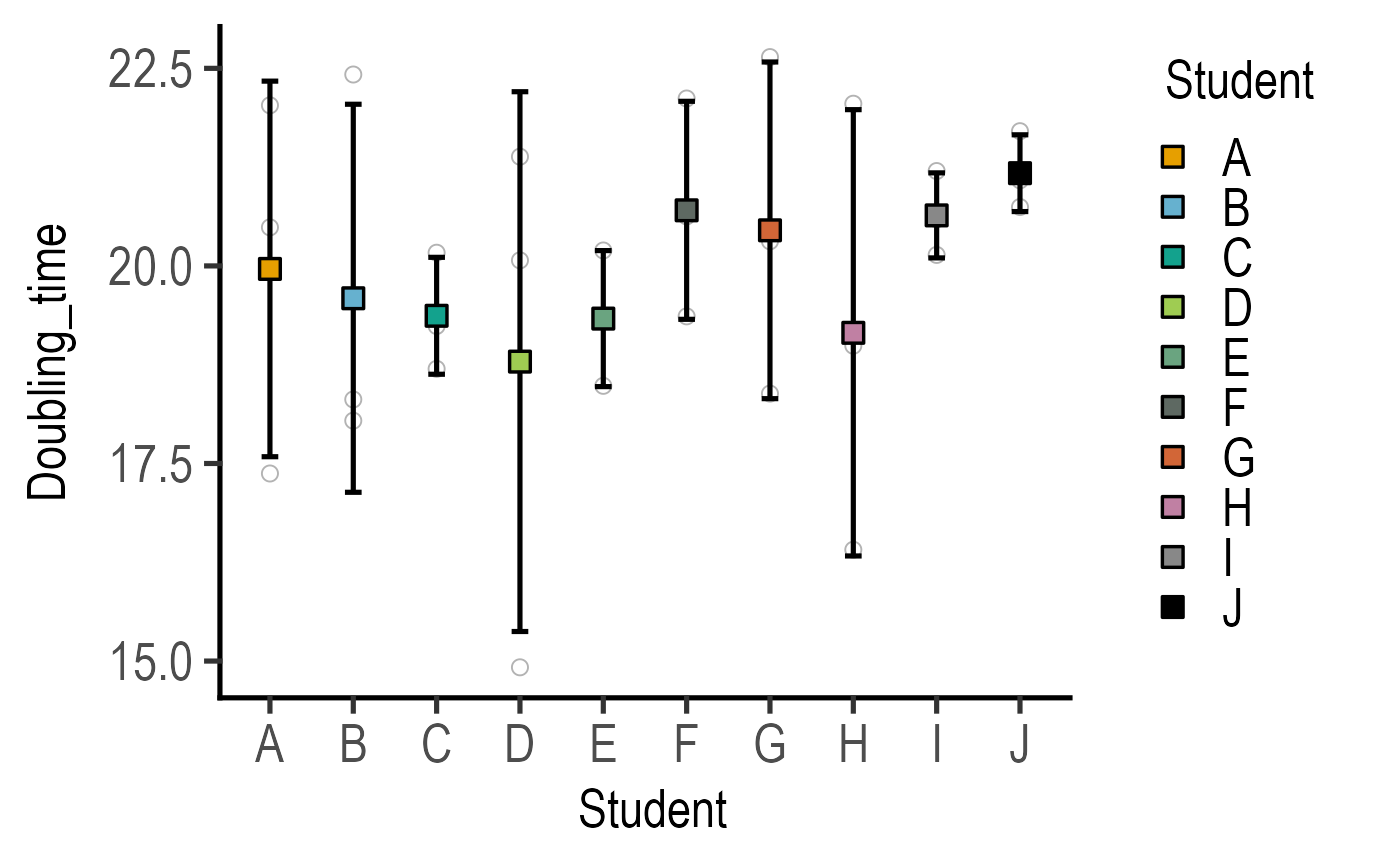
#Basic usage
plot_point_sd(data = data_doubling_time,
xcol = Student, ycol = Doubling_time)