Plot scatter dots on a bar graph with SD error bars with two variables.
Source:R/plot_scatterbar_sd_sc.R
plot_scatterbar_sd_sc.RdThis function is related to plot_scatterbar_sd, but this one maps a single or same colour, therefore _sc.
The only new argument is colour, which can be any hexcode or name of colours in the all_grafify palette.
The default colour is ok_orange. ColPal and ColRev arguments are not available. Colours available can be seen quickly with plot_grafify_palette.
plot_scatterbar_sd_sc(
  data,
  xcol,
  ycol,
  colour = "ok_orange",
  symsize = 2.5,
  symthick = 1,
  bwid = 0.7,
  ewid = 0.3,
  jitter = 0.2,
  b_alpha = 1,
  s_alpha = 1,
  TextXAngle = 0,
  fontsize = 20
)
Arguments
- data
a data table object, e.g. data.frame or tibble.
- xcol
name of the column to plot on X axis. This should be a categorical variable.
- ycol
name of the column to plot on quantitative Y axis. This should be a quantitative variable.
- colour
colour of boxes and dots; a number between 1-64, any hexcode or names from
grafifycolour palettes. Default isok_orange.- symsize
size of point symbols, default set to 2.
- symthick
thickness of symbol border, default set to 1.
- bwid
width of bars, default set to 0.7
- ewid
width of error bars, default set to 0.3.
- jitter
extent of jitter (scatter) of symbols, default is 0 (i.e. aligned symbols). To reduce symbol overlap, try 0.1-0.3 or higher.
- b_alpha
fractional opacity of bars, default set to 1 (i.e. maximum opacity & zero transparency).
- s_alpha
fractional opacity of symbols, default set to 1 (i.e. maximum opacity & zero transparency).
- TextXAngle
orientation of text on X-axis; default 0 degrees. Change to 45 or 90 to remove overlapping text.
- fontsize
parameter of
base_sizeof fonts intheme_classic, default set to size 20.
Value
This function returns a ggplot2 object of class "gg" and "ggplot".
Examples
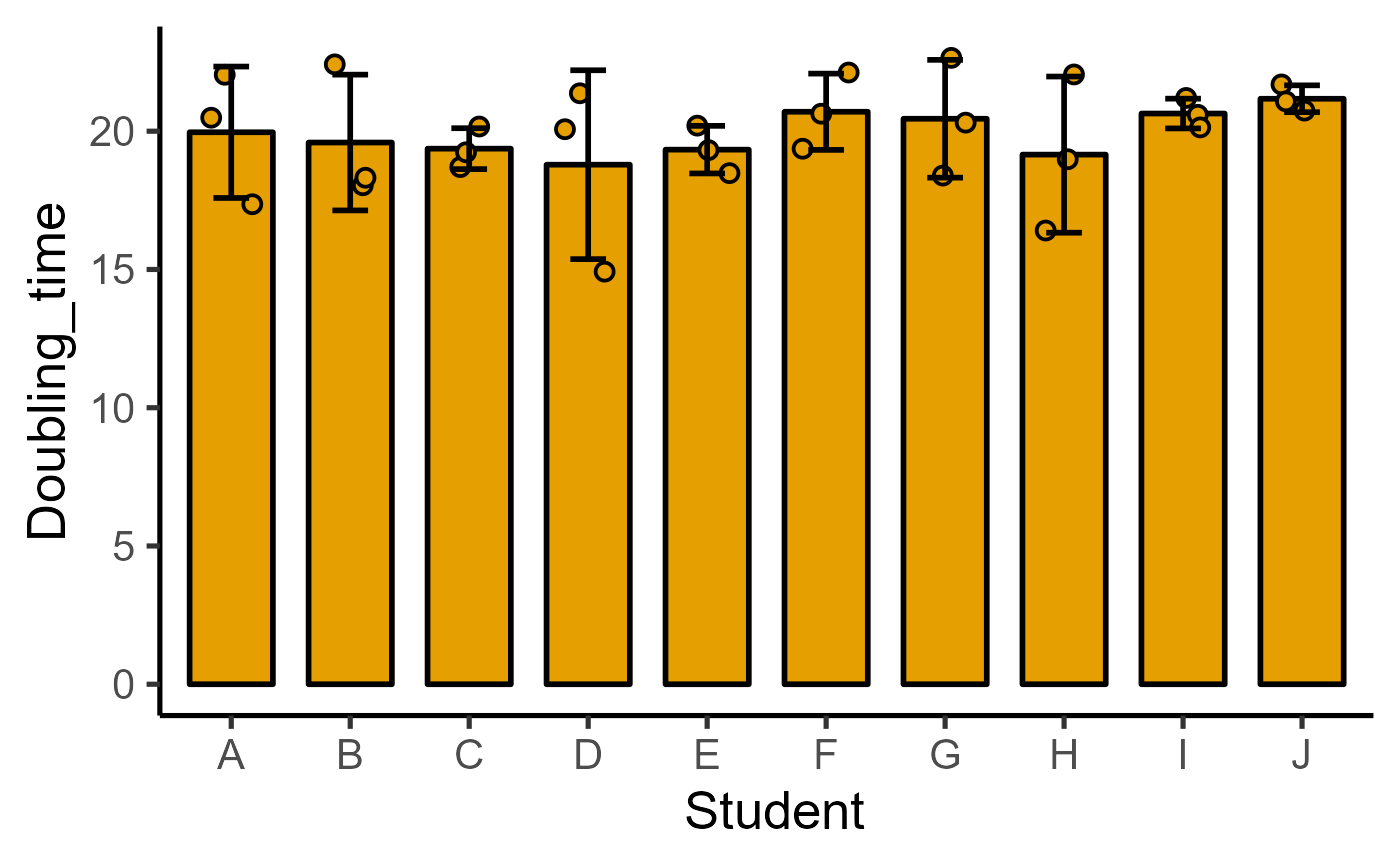
plot_scatterbar_sd_sc(data = data_doubling_time,
xcol = Student, ycol = Doubling_time)
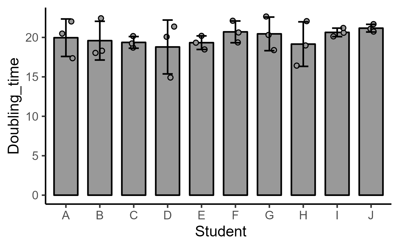
 plot_scatterbar_sd_sc(data = data_doubling_time,
xcol = Student, ycol = Doubling_time,
colour = "ok_grey")
plot_scatterbar_sd_sc(data = data_doubling_time,
xcol = Student, ycol = Doubling_time,
colour = "ok_grey")